# Creating Pages
# Page Types
All NationBuilder page types are supported by this theme. To see what pages you can create on your site click here (opens new window).
# Adding a Featured Image
You can add one or more featured images to any page. To add featured images from a page's editing area, navigate to Settings > Featured content slider.
The recommended image size is 1920x1080. The image will be slightly cropped on various device sizes, ao this will need to be taken into consideration when choosing an image. Images where the main subject is centered, or landscape images, will work best. Images that include text should be avoided.
For this theme, you have three customisable options for each featured image:
- A main heading
- A secondary heading
- A call-to-action button
The text for each of of these items is defined in the Headline / Action text field, and each is seperated by a pipe (|) character. For example, for the following settings:
- Heading: Flood Relief
- Subheading: Helping Communities Rebuild
- Call-to-action button: Donate Now
Your Headline / Action text field would be formatted like so:
Your call-to-action button link must then be defined in the Page to feature* field.
TIP
# Don't want to include a call-to-action button on your featured image?
Since the Page to feature* field is required, you can prevent the call-to-action button from displaying by including the slug of the current page in this field. The theme will detect that the call-to-action directs to to the same page the featured image is on, and prevent the button from displaying.
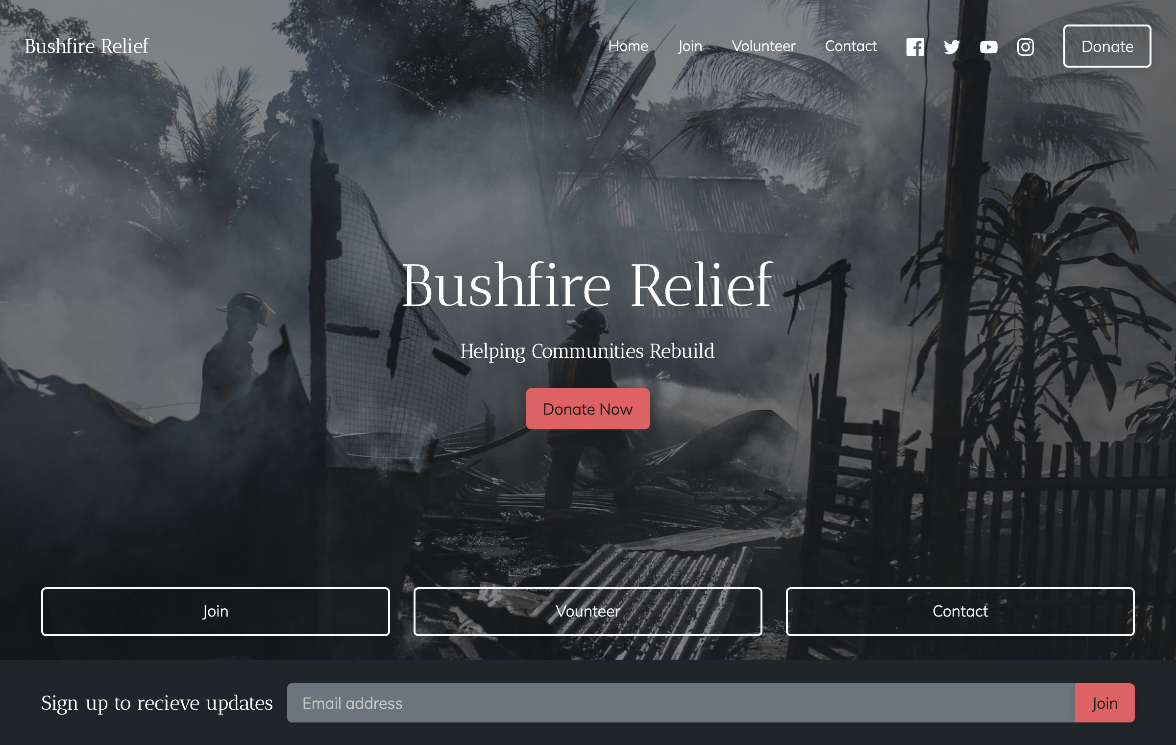
The result would look something like this (home page example):

Click here (opens new window) to see an example.
# Adding Buttons in Page Content
In general page content, you can create styled buttons like so:

To create buttons like these;
- Go to a page's content editor. For basics pages, this is under the Content tab.
- Type the button text, highlight it, and create a hyperlink.
- Enter the linked URL, and close the modal.
- Click the Souce code button in the content editor's header:
- In the HTML code, find the anchor tag for the link you created. It will look something like:
<a href="/">Button</a>
- Add the classes
btn btn-primaryto the button so that the HTML code now looks like:
<a class="btn btn-primary" href="/">Button</a>
- You'll now have blue button.
As in the example above, there a 5 different colored buttons you can create. Simple replace the btn-primary class with either btn-secondary, btn-success, btn-warning, or btn-danger.
# Home Page Features
There are a number of features that are automatically included on the home page:
- The featured image spans the full height of the browser viewport
- The 3 supporter nav links are placed at the bottom of the featured image
- An email signup form is included just below the featured image
Click here (opens new window) to see an example.
# Home Page Custom Settings
There are a some changes you can make to your home page by applying the follow tags:
~setting=home-signup-name-and-email- adds the name fields to the email signup form just below the featured image.~setting=home-signup-name-and-phone- adds the name and phone fields to the signup form just below the featured image (the email field is omitted in this case).